ILCC Part 2 — Introducing the Curves Adjustment Layer

This is a continuation of the introduction to what I have come to call my Intuitive Localized Contrast Control Method, which is essentially dodging and burning by working directly with the tones in the image rather than with the Burn and Dodge tools in the Photoshop toolbar. This post focuses on one of the most important editing tools in Photoshop—the Curves Adjustment Layer and its Layer Mask.

The curves adjustment layer is going to be the primary tool for creating your initial tonal adjustments, overall lightness/darkness, global contrast enhancements, dramatic burning and dodging effects, local subtle tonal changes, and final printing adjustments. The curves adjustment layer is the workhorse tool, and can do just about anything when it comes to tonal edits in your black and white images. There are other adjustment layers that can be use for altering brightness and contrast and input and output points, but nothing is as controllable as a curve adjustment. 


CURVES BASICS

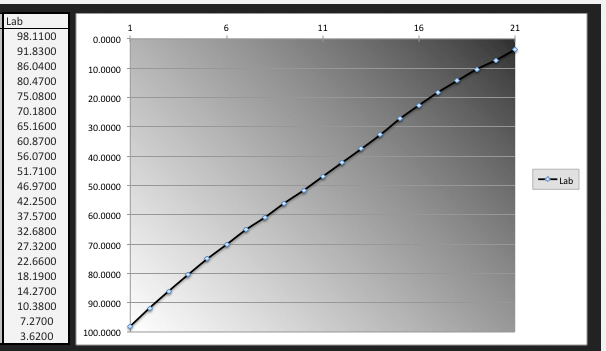
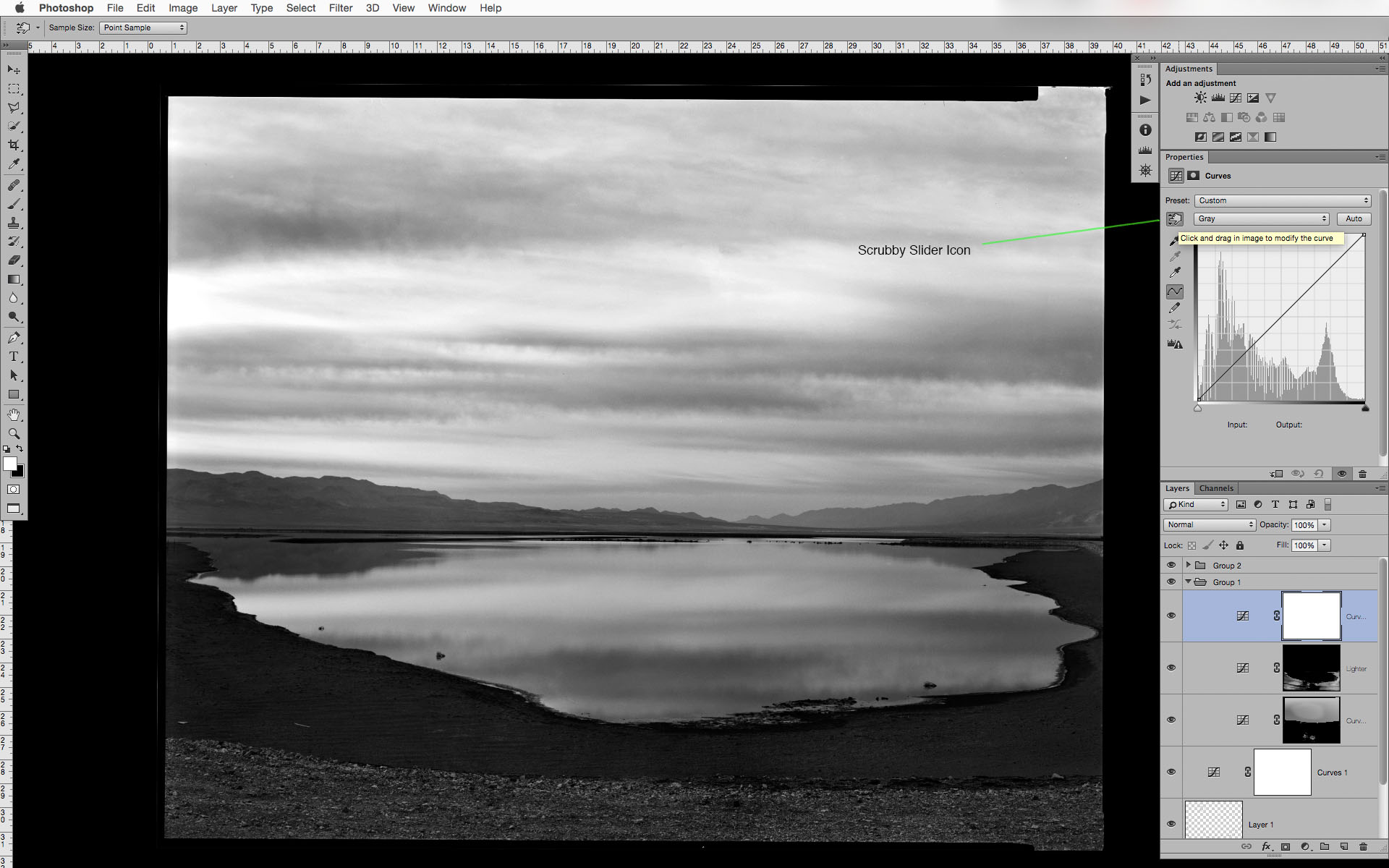
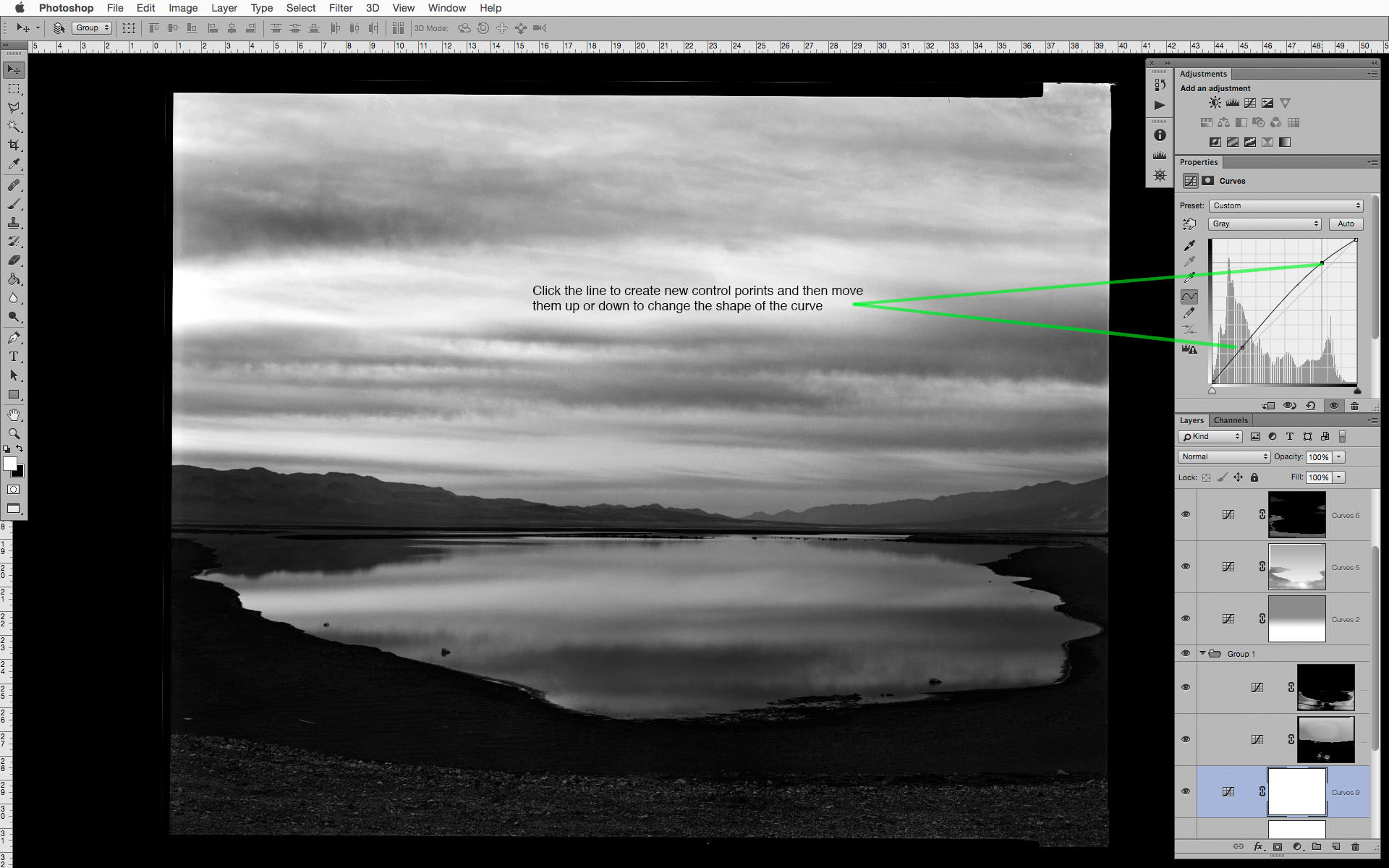
It its most simple form, the curves adjustment layer allows you to define a point on the tonal scale and move it to any other point (within limits—there needs to be a minimum separation from one defined point to another). Photoshop then interpolates the tonal values of all the other points along the scale relative to the adjustment that was made. You can click on the line in the curves property panel to define a control point, or click the Scrubby Slider icon to select the tone to edit by simply clicking on it within your image and dragging that value up or down to make it lighter or darker. It is possible to have as many as 21 different control points per curves layer, but you will find that you rarely need more than 2-3 control points to create a wide range of edits.. One of the most common beginner mistakes is creating too many points with one adjustment layer, which can lead to harsh tonal transitions, reversals, posterization, or other editing artifacts. 

So why not just use the image>adjustment>curves (cmnd[ctrl]+m) rather than a curves adjustment layer?

The standard curves adjustment will permanently alter the image pixels of the image layer it is applied to. If that is done on the background layer, it will have been what is known as a destructive edit—an edit that cannot be modified separately from the image it is applied to. With an adjustment layer, the pixel values in the underlying image layers do not change, but are only affected by the adjustment layers above them. You can return to those adjustment layers at any point and they can be altered again and again until the layers are merged or until they are all flattened down to a single background layer.

So what is the best way to work with the curves adjustment layer?

Well, that depends on the situation... If you are making large global edits that affect the general lightness and darkness or overall contrast, create a new curves adjustment layer, choose a point on the section of the curve where you want to have the majority of your effect take place, and move the point of the curve up or down depending on the adjustment you want to make. Alternatively, and to work more intuitively, you can select the scrubby slider icon and then click (and hold) on the tone in the image that you want to affect and simply drag up to lighten or down to darken. If that isn't the tone you wanted to edit, you can undo or drag the control point off the curve and select an other tone. If you create two or more points that are too close together you will see that it can introduce some dramatic and unwanted effects, so I recommend 1-3 widely spaced control points for global contrast or lightness and darkness edits. 


In the next post I will go into detail about how this workflow differs from how people are usually taught to use adjustment layers and masks, and how you can work directly with the tones in the image without worrying about your image taking on an overly affected and unbelievable quality.

About This Photograph

From now on I will begin giving more details, technical and otherwise, about the photographs used in creating the example screenshots. In many cases they will have not been previously seen or published elsewhere here or on my personal website. In some cases, like this one, the it is still in the editing stage, and is meant to show how I use these techniques on a day to day basis. 

This particular photograph is part of my Lower Owens River Project in a part of Owens (dry) Lake where water is pumped in as part of the Dust Mitigation Project that I recently drum scanned to make a series of larger exhibition prints. The original 8x10 negative was made in 2009, and I there were some developing defects that prevented me from making a final gelatin-silver contact print.

The ability to control all the delicate midtones and highlights in the sky and reflection in the water while at the same time increasing the the dark shadow detail and midtone separation is something that could not have been done as easily in the darkroom. When combined with a smooth rag paper and the Peizography Carbon inks the richness of those tonal values are where images like this can really sing. 

In Search of the Perfect QTR Profile with Multi-Gray Ink Printers

Making profiles for multiply gray dilutions with the traditional QuadTone RIP workflow

I mentioned last year that I was working on a new user guide for creating custom QuadToneRip profiles based on the methods I've been using for the last few years. This simple PDF has taken on a life of its own, and the original idea of a short updated user guide has turned into a full length technical book, and possibly software to make what could be the perfect QTR profile. 

This all started more than a year ago when I was asked to write about digital black and white ink jet printing for someone else's book. That project fell through, but it sent me on a year-long journey testing and comparing prints with nearly every possible method.

I still think that the gold standard for most people is Jon Cone's Piezography method, but there are still people who (like me) are on a budget and want to make their own profiles—either to be able to test different papers, different custom ink mixtures, profile problematic equipment, or just because...

Difficulties of a Six-Ink Profile

The Gradient on the right is a profile with incorrectly set cross over points, and no additional overlap. The gradient on the left has correctly set cross over points and 60% overlap. 

One of the things that sets Piezography profiles apart from QTR profiles is the unique way Piezography partitions the inks and the shape each of the overlapping ink curves and their long trailing edge. QuadToneRip used a much different way of partitioning the grayscale, and, when using the standard ink limit/partitioning method, the shape of each ink's curve is, for the most part, out of your control*.

*There is a way to define a photoshop ACV curve for each ink, but you lose the ability to control the gray curve with the other settings in the ink descriptor file—that is for another post.


The default QTR curve building algorithm has some overlap as one shade passes to the next, and it works well for a K3 profile, but when more than 4 inks are coming in and out of use so rapidly, any mistake with the cross over settings can cause terrible banding and won't linearize when running the QTR profile installer. The trouble is that no matter how carefully you set the cross over points, the shape of the default curves is very "sharp" and can actually be seen as bumps or as horizontal banding in smooth gradients.

The Often Overlooked Gray_Overlap Setting

To minimize the appearance of those bands or sharp edges in the ink curves, I like a lot more of each ink to overlap to smooth the slope and and elongate overlap with the next darker ink(s). This creates a much more gradual ink distribution, and is similar to Jon Cone’s approach to building Piezography profiles, although the QTR curve creation program makes curves with much different shape. I use a GRAY_OVERLAP setting of at least 50, and have now pretty much settled on 75. The maximum value here is 100, but there seems to be little benefit of a setting that high. 

These screen shots illustrate the difference in how increasing the overlap can act to smooth the profile and fill in any noticeable dots as the inks are ramping up and down.

Overcoming the Increase in Density of the Overlap with the Gray_Gamma Setting

Since there is a lot more ink being laid down the increase in dot gain needs to be compensated for by increasing the gray gamma setting in the ink descriptor file. This is essentially a lightness and darkness control similar to the middle slider in the Levels adjustment in Photoshop. A number higher than "1" lightens the print, with a maxiumum value of 10. I usually just set this 1.x with the "x" after the decimal to whatever the overlap is.

Example: if the overlap is 60, then I set the gray gamma to 1.6 (for kozo or other papers where the density increases differently than normal inkjet papers this gamma setting might be 2.2-2.6 for the same overlap setting of 60). That will give the leading edge of each ink curve a much longer and more gradual slope than the default setting of 1.

The Quad Curves in the left hand window have a gray_overlap setting of 75 and gray_gamma setting of 1, are too much "to the left" will print much too dark. The Quad Curves in the right hand window have the same overlap, but a gamma setting of 1.8 

Gray Gamma set to 1 on the left will make a print that is far too dark. The profile on the right has a gamma setting of 1.8. This could have been set to 1.9-2.0 for an even straighter initial gray curve.

Gray Gamma set to 1 on the left will make a print that is far too dark. The profile on the right has a gamma setting of 1.8. This could have been set to 1.9-2.0 for an even straighter initial gray curve.


Near Linear Output Right Out of the Gate

This is an example of a profile I made quickly this afternoon with just two sheets of paper. The luminosity graph is prior to final linearization—just using the built in QTR curve creation program with my system for settings for the ink limits, cross overs and the gray curve. In my book I devote whole section to my approach to setting ink limits—how I determine the optimal density for each shade, and how best to divide up the tonal scale. And another section on how to set the exact cross over point (without using complex math—I've done that for you)

Is all this over kill? Maybe, but the goal is making beautiful prints, and not fighting for days (or weeks) to get a working profile. This is a case where setting things up right to begin with will go a long way to getting a great print as soon as possible. 

Is this approach with QuadToneRip as as effective as using the Piezography system? That is open for debate, and it depends on your goals, equipment, materials, and how comfortable you are getting messy with the inks and density measurements. I usually recommend that people just invest Piezography because it is well established and well supported system with a track record and an aesthetic you can trust. But, if you do want to get down into the weeds, I am writing the guide, and it should be ready for your summer vacation. 
 

My Day Job—Retouching for Reproduction

One of my "day jobs" is scanning, retouching, and designing for offset reproduction for a small photography book publisher, Lodima Press. They undertook an ambitious project in publishing a 19-volume series of the Portfolios of Brett Weston, and are about to go to press with the Volumes 11 through 14.  One reason this blog has been a little light and I haven't posted any tutorials or courses is that I just finished retouching and preparing these four portfolios and three other books about to go to press, I’m now in the middle of a 135-print scanning and retouching job, and I’m starting to design two additional books that will be printed later this year. It has been/will be a busy few months, but I will try to keep the posts coming. 

Example of a quadtone separation with an approximation of the ink color and final contrast 

Brett, along with Edward Weston, was one of my earliest influences, and I still love his work. I visited husband and wife collectors back in 2004 and they asked, do you want to see some early Brett prints? They were from the 1910s-20 all the way through White Sands and New York and on. (One of the things I remember from those early prints is the number of spots he missed or didn't bother with...)

The first 10 volumes of the Lodima Brett Weston series were printed in Belgium by Georges Charlier, of SALTO ULBEEK, who, at the time, was doing things with quad-tone separations at an incredibly high resolution that were far beyond what anyone was doing with high speed offset lithography. Most high-end photography books were printed at a max of 300 line-screen duotone or tritone, but SALTO was able to push this to 600 line-screen quad-tone. Now, with computer-to-plate and stochastic screening, presses are capable of printing at a resolution equivalent to about 400 line-screen tritone. Some presses, like Dual Graphics in Los Angles, are able to print 400 line screen quad tone. The difficulty of printing at that resolution and with that number of separations is being able to push a lot of ink into the paper without blocking up the shadows. It takes tremendous skill on the part of the person making the separations, along with the pressman, to know what the equipment is capable of and how much to push and where to hold back. 

To make the scans of the original Brett Weston Portfolios, Charlier flew to San Francisco and made high resolution scans using a large format copy camera and scanning back with settings that calibrated to his method of making the unique quad-tone separations. To continue printing the series, the publisher was forced to find a press in the United States capable of approaching the print quality of SALTO. They are working with Dual Graphics to continue the project, but that meant the original scans, originally made with SALTO's unique requirements, needed to be  translated and optimized for the new printer.

The prepress department has some control when making the separations and there are some adjustments that can be made on press, but these are the final scans that they will be working with and they need to be as good as possible. The original scans with the embedded ICC camera profile were made to fit SALTO's method, they were all much too dark, and there was no way of simply converting or applying a different profile to match the original. This meant that it was now my responsibility, without having the original prints on hand, to make important aesthetic decisions about how these prints were going to be reproduced. 

With all the control that Photoshop allows, it is easy to go overboard and put too much of yourself and your own aesthetic into retouching and reproducing images. The San Francisco Portfolio had to be printed twice because the first round was too open in the shadows and was not consistent with the way Brett printed. Sometimes this kind of personal involvement is needed in working directly with the artist in printing and reproducing their work, but it is on a case by case basis. 

Many of the pictures in these upcoming portfolios have not been reproduced elsewhere, or if they have, to varying degrees of print quality. Dave Gardner printed a few of Brett's books, and those reproductions could be trusted, but others books were printed much too light or too contrasty. Some variations of similar prints were published previously, but editing the scans with his intention in mind really required an understanding of how Brett tended to print and his compositional concerns and themes: things like negative space, curved shapes, and how he used what we might call blocked-up shadows. Working with the publishers, who also knew Brett well personally, and with an intimate understanding of his work, these reproductions will be as identical to the originals as possible.  

One of the benefits of the widespread use of digital editing and the relative ease of self publishing is that photographers now are able to create their own books. Scanning and retouching for reproduction is an art form in itself and in a future post I will show my own workflow for scanning, whether for simple web use, print on demand, or larger-run offset reproduction.

You can order the previously published books, in either a numbered hardbound collector's edition or softbound edition, as well as subscribe to the next 9 volumes here:

http://lodima.org/books/subscriptions-series/the-portfolios-of-brett-weston/


NOTE: Georges Charlier is also known for his incredible platinum prints made from five separation negatives, and along with Amana Holdings in Japan, has since developed a process of exposing the platinum coated paper directly from an image setter—doing away with the need for separation negatives. As far as I know, they are the only ones in the world capable this. http://amanasalto.com/en/


Trees and Originality — One From the Archives

I was doing some updating of the Lower Owens River Project page on my personal website and came across this old blog post from way back in 2007. I think it is worth reposting here.

Back then I didn't do much digital work at all, and most everything was 8x10 contact prints on Kodak Azo  (scroll down for a laugh at my youngster self with the green monster). Over the next few months I'm going to be drum scanning and making much larger Piezography prints of lots of this older work. I plan on making a series of posts about the process and how the experience and prints compare to the original darkroom prints.

trees-and-originality-Owens-Valley.jpeg

Originally Published 8/8/2007

 https://richardboutwell.wordpress.com/2007/08/08/trees-and-originality/

After just finishing some printing and scanning of more photographs from my last trip to California, I was talking with someone about photographing the Lower Owens River Project. I mentioned that part of what I am doing documenting the changes in the landscape. But along with that, I want to make personal records of what I feel makes this place so special. That thought was reaffirmed earlier this evening as I was reading an essay that, on the surface, was a defense of straight photography which draws its inspiration from the natural world.

Some people believe, because that specific "genre" has been so thoroughly explored, there is no possibility for originality by working in such" traditional" ways. The essay I was reading earlier tonight was born from that very argument. Originally written in 1976 by a graduate student at RISD, and to substantiate his point of view, he included ideas about the nature of art, originality, and expression—some of which are the best I have ever read. There are several other articles and essays here that I should to have enough time this week on which to read and reflect. But, in the mean time, I will simply post a statement by the Modernist painter, Paul Klee.


This was originally published 1924 in Modern Artists on Art, and, I think, it is still as relevant as ever.

For the Artist, communication with nature remains the essential condition. The artist is human; himself nature; a part of nature within natural space."
May I use the simile of a tree? The artist has studied this world of variety,, and has, we may suppose, unobtrusively found his way in it. His sense of direction has brought order into the passing stream of image and experience. This sense of direction in nature and life, this branching and spreading array, I shall compare with the root of the tree.
From the root the sap flows to the artist, flows through him, flows to his eyes.
Thus he stands as the trunk of the tree.
As in full view of the world, the crown of the tree unfolds and spreads in time and in space, so with his work.
Nobody would affirm that the tree grows its crown in the image of its roots. Between above and below can be no mirrored reflection.


And yet, standing at his appointed place he does nothing more that gather and pass on what come to him from the depths. He neither serves nor rules—he transmits.

His position is humble. And the beauty at the crown is not his own. He is merely a channel.

--Paul Klee

Intuitive Localized Contrast Control: Part 1 — Burning and Dodging

Photographers coming from the darkroom are accustomed to the terms Burning and Dodging, to "make darker" and "make lighter". This is one of the foundations of gelatin silver printing, and one of the first things taught when the safelight comes on.

If you are coming to digital editing from the traditional darkroom, the concept of burning and dodging is obvious to you, but more and more people are coming directly to digital photography and never having a connection to making prints with light, paper, and chemicals. So for you digital people: Burning and Dodging is one of the carryover terms from the analog darkroom, where to make an area darker, you would "burn it in" by allowing more light to pass through the negative. I can't tell you how many different size pieces of cardboard with various sizes and shapes cut in them I have strewn about the darkroom. Dodging is simply blocking some of the light from passing through the negative during the initial exposure, either with cardboard shapes taped to pieces of bent coat hangers or shapes made with your hands and fingers—print-making with shadow puppets.

Back in my post, It Only Looks Steep When You're Standing at the Bottom, I talked about images being made of individual tones, and the difference between those tones is "contrast", which makes up the perception of detail. This is the same concept when printing in the darkroom, changing local contrast by burning and dodging, and by split-filter printing (burning/dodging with different contrast filters with MultiGrade papers). A similar effect can be achieved with graded papers since the increase or decrease in exposure affects tonalities differently depending on the density of the negative. While these techniques are mostly associated with changing the overall lightness and darkness, they are also very useful ways of changing local contrast.

Between 2002-2008, when I worked in the darkroom shaking trays and finishing prints—sometimes for 50-60 hours a week—it was drilled into me that tone and local contrast is as much of a structural element as the trees, rocks, or buildings in a picture, and that you can change the structure of a picture by burning or dodging a bit of road here, or some leaves there. I learned techniques to make some leaves or reflected water separate just a little more, changing the local contrast ever so slightly with a little wave of a hand under the light. These are often only slight changes from print to print, made on the fly after years of experience of knowing how different materials react, but you develop an eye for subtlety, and subtlety is what separates a good print from a great print.   

Original Color Capture 1 Export

Example Burn and Dodge Curves Layer Masks

Example Burn and Dodge Curves Layer Masks

Final Edited Black and White Conversion


So how can this be translated to working digitally? 
Just like first learning to burn and dodge in the darkroom, one of the first techniques I teach when using Photoshop is to work intuitively with curves adjustment layers and their associated layer masks. Instead of developing years of trial and error experience to know how printing materials react to different filters and increases or decreases in exposure, and creating multiple test prints, we can now respond immediately to the image on the display and how the feeling and structure of it changes when altering differences between tones.

Digital editing has taken those same basic ideas from the darkroom and given us a far greater degree of control, and the ability to fine tune the tonal values of the image in ways never possible in the darkroom. While this can lead to some garish and terrible aesthetic decisions, it can also enable enhancements that can bring life to an otherwise lackluster composition, or make an already good picture a great one. 

As I mentioned earlier, contrast is simply the degree of difference between one tonal value and the next. When burning and dodging we are simply either increasing or decreasing the contrast of one local area compared to other local areas. While we might be making things lighter or darker, not all tones along the scale are changing at the same rate. Sometimes more of the change happens in the midtones relative to the shadows, etc.  With the curves adjustment layer we can specify what range of tones is changing, and to what specific value. Then when used with a layer-mask we can control how much of that overall edit is able to affect local areas.

Don't Burn and Dodge with the Burn and Dodge Tools
Why not just use the dodge and burn tools in the toolbar? Those burn and dodge tools (keyboard shortcut - 'O' ) use preset formulas to control the effect of the adjustment, and only work on an image/pixel layer. To work non-destructively you will need to have a copy of the image layer for each of the burn/dodge layers you create. You might have different layers that either deal with separate parts of the tonal scale, or are separated into a "burn" layer and a "dodge" layer. If you have several of these 16-bit image layers, the file size can start to balloon pretty quickly. While there are a few additional controls that allow the burn/dodge adjustment to affect the shadows/midtones/highlights separately, there is no way to control the maximum adjustment, so it is possible to go way overboard without the ability to easily dial it back later in the editing process. This lack of ability to easily dial back or undo the burn/dodge effect is the biggest drawback of using these tools—it is possible, but not easy nor intuitive. It involves making a history snapshot before making the edits and then painting with the history/eraser brush, but it doesn't allow you to re-edit or change the contrast without doing even more burning and dodging.

Instead of simply referring to the curves adjustment layer and masking technique as "Burning and Dodging", which can be confused with the the Burn and Dodge tool in the Photoshop toolbar, I call this method Intuitive Localized Contrast Control, or ILCC for short. In the next post I will introduce the use of the curves adjustment layer and how it can be more useful than many of the other lightness and contrast adjustment layers.

Comparing Cone Piezography Shade 1 and MIS Ebony Shade 1

This post is just an initial demonstration about the differences of the matte black ink between two different third party ink manufacturers' dedicated black and white inksets. This will not explain the differences between the processes of how the inks are used, but only that they are not interchangeable and will require custom profiling depending on which inks are used. 

This came up recently on a Yahoo group discussion about the interchangeability of the two different shade 1 inks, and is an further explanation of my comment there. This will not be an explanation of the QuadTone Rip profiling/calibration process so some of what follows might not make sense to those who are not familiar with the QTR profiling and printing process. 

The Measurement Process

When I first begin to profile a new paper or inkset, I start by printing and measuring the densities of the separate ink channels. These are printed at 100% so I can see what the maximum ink load the paper is capable of handling, and to see how the paper responds to different inks. One paper might be better with one inkset over an other, and a different paper might respond completely opposite. This in't crucial, but interesting when determining what few papers you might decide to settle on.

I print the ink separation page at 100% of the ink limit, and then immediately measure the chart with an i1 Pro using MeasureTool (Measure Tool is foolproof when measuring charts compared to "smarter" programs like i1 Profiler or ColorPort—I am now making reference files that make this process compatible with currently supported software). When I was testing the drying times of different inks and papers for my upcoming book I would measure every these charts every three hours, but now I measure a chart at as soon as it comes out of the printer and then again about 12 hours later. I might measure again at 24 hours depending on my schedule, but in any case, I've found that after about 12 hours the prints are fully "dry" and the densities will stop shifting one way or another. I haven't yet tested how long it takes in front of a space heater or hair dryer...

The other benefit of making the measurements of the inks at 100% and then keeping the measurement file around is that if you ever have a problem with a paper or inkset you can reprint the target and compare the measurements against the ones used to make the original profile. I keep a separate folder for each paper with all the measurement files on my computer named by paper, inkset, and drying time. That might be overkill for the day to day user, but is helpful for me when writing posts like this too see how one printer does with one inkset of another. Again, I'm not recommending people do this—print the target, let it dry over night and then measure it and you'll be fine. It can be a lot of measuring, and i'm saving my pennies for an automated chart reader... 

The Tests

The following screen shots show the difference between shades 1 and 2 for each different ink on two different papers. After measuring the 100% ink limit targets I print the targets again with ink limits set to be evenly distributed between paper white and the D-max. Those are the limits I use to make the QTR profile. The Flat parts of the ink curve is something that I have only found with the Epson 1430 printer, and happens at about the same point for each ink and I suspect it is a function of the dithering algorithm. 

One large difference between the two inksets is that the Cone Shade 2 is a darker dilution than the Ebony Shade 2. The other is that the shade 1 in Ebony inkset tends to reach its D-max sooner and then levels off with only a slight decrease in density after the paper is fully saturated. The Cone shade 1 tends to drop off much faster and isn't as forgiving if the ink limit for shade 1 is set too high. A point about setting ink limits for shade 1: I actually don't recommend people set the ink limit for shade 1 at the absolute D-max since it can block up a sooner and give you problems when you go to linearize the gray curve. I set my ink limit to the point before it starts to level off and then use the "BOOST_K=" option set to a point 5-10 points above the K ink limit. 

The screen shots below are from my measurements of Canson Rag Photographique and Hahnemühle Photo Rag 188.  The graph is part of my spreadsheet template I developed for QTR profile creation, and which will be made available with my upcoming QTR book. 

Ray K. Metzker, Modern Master 1931–2014

Something I think about quite a lot are the photographers that have shaped how we think, talk, and go about making photographs.  I have been wanting to start a series that looks at certain "themes" and step back to look at the early influences of those ideas and themes and what they can teach us about the picture making experience, composition, printing. While they might not have agreed with being known as "masters of photography" their influence will last long into the future. 

I was in the middle of writing such a post tonight when I leaned that photography lost one of those modern masters today. Ray Metzker has passed away at the age of 83. His current show of unique gelatin-silver photographs, constructions, and works on paper—unique as in the only one in existence—is appropriately titled One and Only, and runs through October 25th at the Lawrence Miller Gallery in New York.

Ray K. Metzker, American (b. 1931). Feste di Foglie, Italy, 1985 © Ray K. Metzker, Courtesy of the Laurence Miller Gallery.

Metzker's work is an example of how a photographic vision can continue to grow throughout the life of the artist as ideas are explored and expanded upon over a full career of genuine creativity. The tonal, structural, and temporal constructions in his earlier photographs and experimentations influenced his later straight photographs with the same sense of complexity and structural ambiguity. His book, LANDSCAPES, is one of my personal favorites, and influences in the way that it deals with light and the liveliness of trees. 

He came into photography during the fervent time of the 1960s, when the medium was still struggling to be "accepted" as a legitimate art form, and coming away from the "West Coast/East Coast/European" influences that began in the 1930s. In a way, his early photographs could only have been made at that time between the 1960s and 1970s. The techniques and spontaneity and delayed feedback allowed the photographers to create pictures in a much more freely than it is now possible.

I doubt that the same kinds of photographs would be made with today—it is too easy to look at the back of the camera to see if you got it. It doesn't allow for as much discovery if you are always worried about "getting it". Additionally I doubt they would be recognized and valued in the same way if they were made today with todays digital technology and editing tools; the analogue techniques for creating those kinds of composites and multiple exposures were so much more difficult to do well, the digital equivalent might now just be seen as gimmicky and ineffective.


In any case, the thing that drives masters of any medium is that they all set out to create work that is interesting to them personally, which is really what we respond to as viewers and why they will be remembered as great artists. 

Workflows

Get good at one or two and ignore the rest. 

I was thinking a lot about the different Black and White workflows, and digital editing workflows as a whole after the Photoshop Elements post I made yesterday. I think there is a case that it is better to choose one or two methods and get really good with them and then ignore all the rest, no matter how much better or easier people claim the new thing might be. I have as hard a time as anyone with that—I am testing and writing a review of the new release of Capture1 Pro 8 (changing the name might be an improvement too). The point is the more time spent learning different software and workflows the less time/energy/bandwidth there is to focus on the work. It is up the the user to define what their intention for the work is and balance tools/software/workflows with image quality requirements and personal preferences.  

I find that making local tonal edits in Photoshop is easier, more intuitive, and more definable than using the control points and gradients in Lightroom or Capture 1 (and SEP too I imagine). In photoshop the curves/masks are easy to re-edit, use with blending modes, and then fine tune with layer and mask opacities. One thing I couldn't live without is the ability to turn the visibility of the adjustment layer on and off the and enable/disable the mask quickly see the before and after of each individual adjustment with/without the mask. 

With my Digital workflow, I tend to always be moving forward and rarely do I need to go back and re-edit the raw file, so I never use smart object or do all my edits in Lightroom or capture 1. In a way it is based a more analogue style workflow: Develop the film, make proofs, and then do my dodging and burning when making the print. Each step has a specific goal and method. 

My digital workflow is as follows:

  1. I do a quick RAW adjustement (usually of single files I've already decided on) in either Lightroom, Camera Raw, or Capture 1 (it is usually Capture 1 for my personal work). If the picture could benefit from large gradient adjustments or general local contrast adjustments I do that in one of two layers in Capture 1, or just export a lighter/darker virtual copies from Lightroom .
  2. Then I export those "developed" files as full size RGB 16-bit tiffs.
  3. I do my black and white conversion in either Silver Efex or Photoshop (with the black and white adjustment layer, or multiple B&W adjustment layers if it benefits from a blend of different color filtration settings)
  4. Once the conversion is made I convert to a 16-bit greyscale and then do my dodging and burning in photoshop with curves adjustment layers and masks.

Drum Scan, Invert and Correct in Photoshop, Optimize for Print or Web

Working from film scans it is much the same:

  1. Develop the film
  2. Do a quick batch scan on a flatbed to make proofs (similar to an import to Capture 1 or Lightroom).
  3. Select the few I want and drum scan only those negatives (similar to the develop mode in the digital workflow).
  4. Do the inverting and contrast adjustment, and then all the burning and dodging in Photoshop. 
  5. Then either output a digital negative to make platinum/palladium prints or make a direct inkjet print.

But like I said, so much of it is just experience and familiarity of the interface of the tools available to you. I try to get people to see past the immediate intimidation of Photoshop and start to work with a few powerful yet easy to use features. When some things are tried to be made "easier" like auto levels, or preset develop modes in Lighroom or Silver Efex it can often do more harm to the image than learning how to use the small number of tools that will give you the best results.