An intuitive approach to using Photoshop curves adjustment layers, luminosity masks, and refined selections.

BLOG
Every Journey Needs a Journal
This is a continuation of the introduction to what I have come to call my Intuitive Localized Contrast Control Method, which is essentially dodging and burning by working directly with the tones in the image rather than with the Burn and Dodge tools in the Photoshop toolbar. This post focuses on one of the most important editing tools in Photoshop—the Curves Adjustment Layer and its Layer Mask.
The curves adjustment layer is going to be the primary tool for creating your initial tonal adjustments, overall lightness/darkness, global contrast enhancements, dramatic burning and dodging effects, local subtle tonal changes, and final printing adjustments. The curves adjustment layer is the workhorse tool, and can do just about anything when it comes to tonal edits in your black and white images. There are other adjustment layers that can be use for altering brightness and contrast and input and output points, but nothing is as controllable as a curve adjustment.

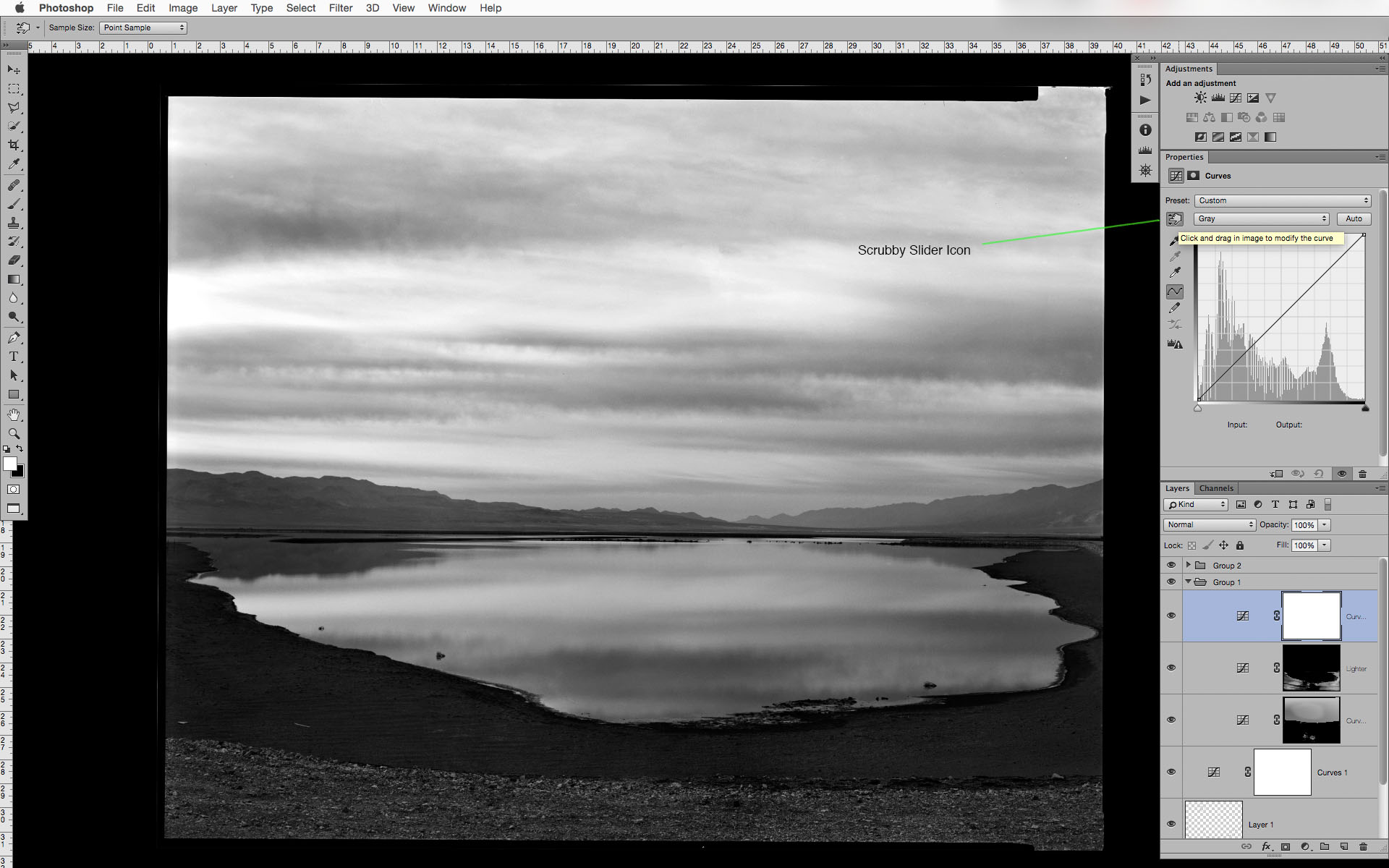
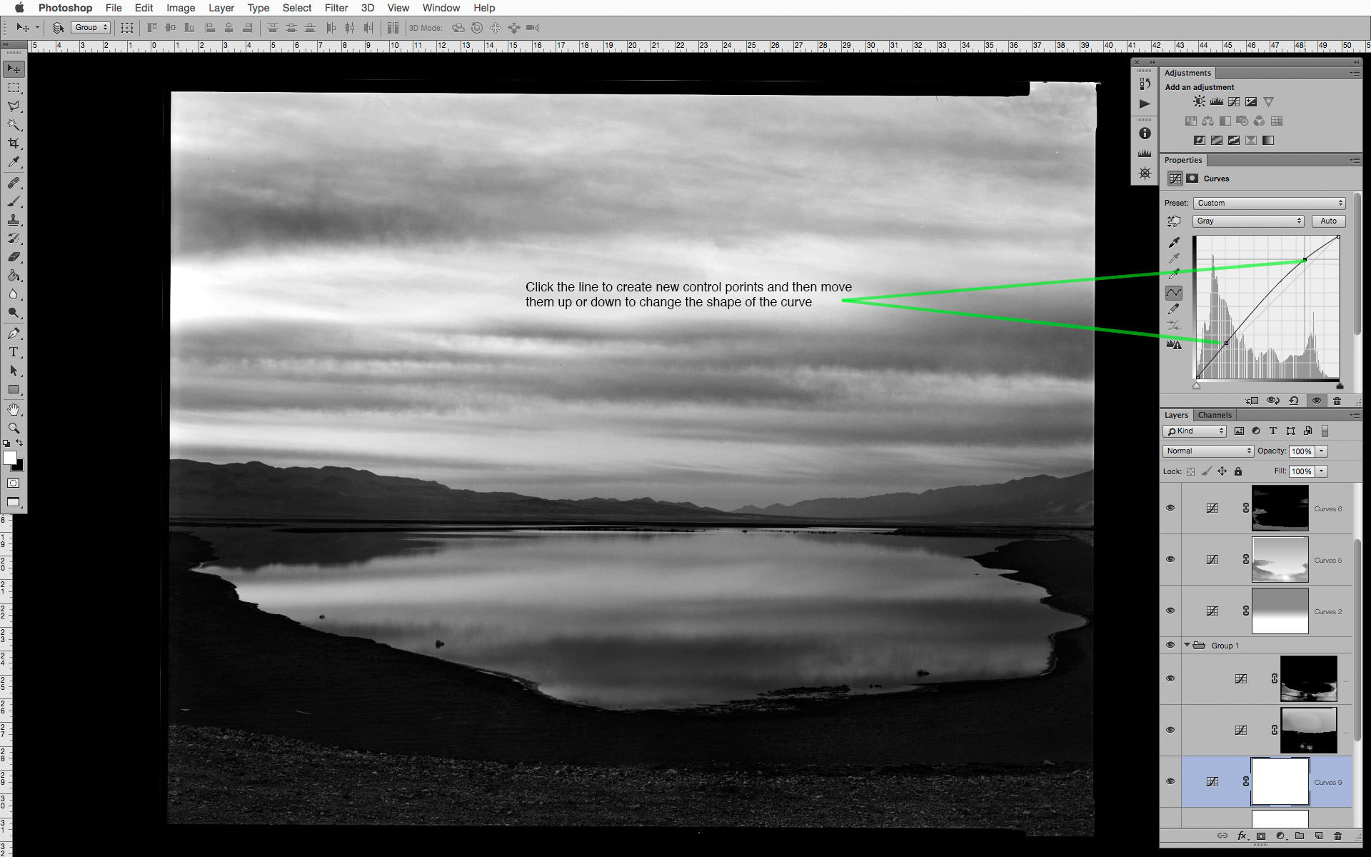
It its most simple form, the curves adjustment layer allows you to define a point on the tonal scale and move it to any other point (within limits—there needs to be a minimum separation from one defined point to another). Photoshop then interpolates the tonal values of all the other points along the scale relative to the adjustment that was made. You can click on the line in the curves property panel to define a control point, or click the Scrubby Slider icon to select the tone to edit by simply clicking on it within your image and dragging that value up or down to make it lighter or darker. It is possible to have as many as 21 different control points per curves layer, but you will find that you rarely need more than 2-3 control points to create a wide range of edits.. One of the most common beginner mistakes is creating too many points with one adjustment layer, which can lead to harsh tonal transitions, reversals, posterization, or other editing artifacts.
So why not just use the image>adjustment>curves (cmnd[ctrl]+m) rather than a curves adjustment layer?
The standard curves adjustment will permanently alter the image pixels of the image layer it is applied to. If that is done on the background layer, it will have been what is known as a destructive edit—an edit that cannot be modified separately from the image it is applied to. With an adjustment layer, the pixel values in the underlying image layers do not change, but are only affected by the adjustment layers above them. You can return to those adjustment layers at any point and they can be altered again and again until the layers are merged or until they are all flattened down to a single background layer.
So what is the best way to work with the curves adjustment layer?
Well, that depends on the situation... If you are making large global edits that affect the general lightness and darkness or overall contrast, create a new curves adjustment layer, choose a point on the section of the curve where you want to have the majority of your effect take place, and move the point of the curve up or down depending on the adjustment you want to make. Alternatively, and to work more intuitively, you can select the scrubby slider icon and then click (and hold) on the tone in the image that you want to affect and simply drag up to lighten or down to darken. If that isn't the tone you wanted to edit, you can undo or drag the control point off the curve and select an other tone. If you create two or more points that are too close together you will see that it can introduce some dramatic and unwanted effects, so I recommend 1-3 widely spaced control points for global contrast or lightness and darkness edits.
In the next post I will go into detail about how this workflow differs from how people are usually taught to use adjustment layers and masks, and how you can work directly with the tones in the image without worrying about your image taking on an overly affected and unbelievable quality.
From now on I will begin giving more details, technical and otherwise, about the photographs used in creating the example screenshots. In many cases they will have not been previously seen or published elsewhere here or on my personal website. In some cases, like this one, the it is still in the editing stage, and is meant to show how I use these techniques on a day to day basis.
This particular photograph is part of my Lower Owens River Project in a part of Owens (dry) Lake where water is pumped in as part of the Dust Mitigation Project that I recently drum scanned to make a series of larger exhibition prints. The original 8x10 negative was made in 2009, and I there were some developing defects that prevented me from making a final gelatin-silver contact print.
The ability to control all the delicate midtones and highlights in the sky and reflection in the water while at the same time increasing the the dark shadow detail and midtone separation is something that could not have been done as easily in the darkroom. When combined with a smooth rag paper and the Peizography Carbon inks the richness of those tonal values are where images like this can really sing.
Photographers coming from the darkroom are accustomed to the terms Burning and Dodging, to "make darker" and "make lighter". This is one of the foundations of gelatin silver printing, and one of the first things taught when the safelight comes on.
If you are coming to digital editing from the traditional darkroom, the concept of burning and dodging is obvious to you, but more and more people are coming directly to digital photography and never having a connection to making prints with light, paper, and chemicals. So for you digital people: Burning and Dodging is one of the carryover terms from the analog darkroom, where to make an area darker, you would "burn it in" by allowing more light to pass through the negative. I can't tell you how many different size pieces of cardboard with various sizes and shapes cut in them I have strewn about the darkroom. Dodging is simply blocking some of the light from passing through the negative during the initial exposure, either with cardboard shapes taped to pieces of bent coat hangers or shapes made with your hands and fingers—print-making with shadow puppets.
Back in my post, It Only Looks Steep When You're Standing at the Bottom, I talked about images being made of individual tones, and the difference between those tones is "contrast", which makes up the perception of detail. This is the same concept when printing in the darkroom, changing local contrast by burning and dodging, and by split-filter printing (burning/dodging with different contrast filters with MultiGrade papers). A similar effect can be achieved with graded papers since the increase or decrease in exposure affects tonalities differently depending on the density of the negative. While these techniques are mostly associated with changing the overall lightness and darkness, they are also very useful ways of changing local contrast.
Between 2002-2008, when I worked in the darkroom shaking trays and finishing prints—sometimes for 50-60 hours a week—it was drilled into me that tone and local contrast is as much of a structural element as the trees, rocks, or buildings in a picture, and that you can change the structure of a picture by burning or dodging a bit of road here, or some leaves there. I learned techniques to make some leaves or reflected water separate just a little more, changing the local contrast ever so slightly with a little wave of a hand under the light. These are often only slight changes from print to print, made on the fly after years of experience of knowing how different materials react, but you develop an eye for subtlety, and subtlety is what separates a good print from a great print.
Original Color Capture 1 Export

Example Burn and Dodge Curves Layer Masks
Final Edited Black and White Conversion
So how can this be translated to working digitally?
Just like first learning to burn and dodge in the darkroom, one of the first techniques I teach when using Photoshop is to work intuitively with curves adjustment layers and their associated layer masks. Instead of developing years of trial and error experience to know how printing materials react to different filters and increases or decreases in exposure, and creating multiple test prints, we can now respond immediately to the image on the display and how the feeling and structure of it changes when altering differences between tones.
Digital editing has taken those same basic ideas from the darkroom and given us a far greater degree of control, and the ability to fine tune the tonal values of the image in ways never possible in the darkroom. While this can lead to some garish and terrible aesthetic decisions, it can also enable enhancements that can bring life to an otherwise lackluster composition, or make an already good picture a great one.
As I mentioned earlier, contrast is simply the degree of difference between one tonal value and the next. When burning and dodging we are simply either increasing or decreasing the contrast of one local area compared to other local areas. While we might be making things lighter or darker, not all tones along the scale are changing at the same rate. Sometimes more of the change happens in the midtones relative to the shadows, etc. With the curves adjustment layer we can specify what range of tones is changing, and to what specific value. Then when used with a layer-mask we can control how much of that overall edit is able to affect local areas.
Don't Burn and Dodge with the Burn and Dodge Tools
Why not just use the dodge and burn tools in the toolbar? Those burn and dodge tools (keyboard shortcut - 'O' ) use preset formulas to control the effect of the adjustment, and only work on an image/pixel layer. To work non-destructively you will need to have a copy of the image layer for each of the burn/dodge layers you create. You might have different layers that either deal with separate parts of the tonal scale, or are separated into a "burn" layer and a "dodge" layer. If you have several of these 16-bit image layers, the file size can start to balloon pretty quickly. While there are a few additional controls that allow the burn/dodge adjustment to affect the shadows/midtones/highlights separately, there is no way to control the maximum adjustment, so it is possible to go way overboard without the ability to easily dial it back later in the editing process. This lack of ability to easily dial back or undo the burn/dodge effect is the biggest drawback of using these tools—it is possible, but not easy nor intuitive. It involves making a history snapshot before making the edits and then painting with the history/eraser brush, but it doesn't allow you to re-edit or change the contrast without doing even more burning and dodging.
Instead of simply referring to the curves adjustment layer and masking technique as "Burning and Dodging", which can be confused with the the Burn and Dodge tool in the Photoshop toolbar, I call this method Intuitive Localized Contrast Control, or ILCC for short. In the next post I will introduce the use of the curves adjustment layer and how it can be more useful than many of the other lightness and contrast adjustment layers.
I woke up to a foggy morning today so I made a french press, grabbed the dog and camera, and hit the woods.
When I got back to download the pictures I made and started editing the images I thought it would be a good opportunity to demonstrate how you can export multiple virtual copies of the same raw file with different contrast and black and white filtration settings from Lightroom. This is to allow you to finely tune to image in photoshop with greater flexibility and less reliance on multiple and possible conflicting adjustment layers.
Since you are also working with image layers made from adjustments to the raw file the tonal range is smoother than if additional adjustment layers were made to a single file with general Lightroom/Camera Raw development settings.
Here is the scene as shot and cropped to a 1:2 aspect ratio.
In the first virtual copy, I got the overall exposure and contrast curve where I wanted—no clipping and a full range of tones. The intention was to keep this version of the image on the flat side as a base to build more contrast in Photoshop.
Virtual copy of the color version with auto black and white settings and slight increase in contrast.
I then created another virtual copy with an exaggerated yellow/yellow green filtration and increased contrast. This blows out some of the highlights in the foggy areas, which I will mask out in photoshop (I still find that it is much easier and faster to this masking in Photoshop rather than using the brush adjustments in Lightroom).
Virtual copy-2 with exaggerated yellow/green filtration and increased contrast.
Then I export those two above copies as 16-bit tiffs and then stack the contrasty version on top of the version with less contrast. I can then create a layer mask to paint in the areas where I want the yellow/green filtration version to come through. In the case above it contrast was built up with an inverted layer mask and painting with a white brush at a low opacity/fill amount to reveal differing amounts of the layer. Then I used my standard approach of burning and dodging adjustment layers to achieve the final tonal and structural balance.
Then I export those two above copies as 16-bit tiffs and then stack the contrasty version on top of the version with less contrast. I can then create a layer mask to paint in the areas where I want the yellow/green filtration version to come through. In the case above it contrast was built up with an inverted layer mask and painting with a white brush at a low opacity/fill amount to reveal differing amounts of the layer. Then I used my standard approach of burning and dodging adjustment layers to achieve the final tonal and structural balance.
Final Version
This is a variation of the same technique with even more yellow/green filtration and increased contrast. This is just to illustrate the importance of not relying on presets and plug-ins for making the initial black and white conversion and contrast adjustments.
The scene as shot
Neutral Black and White Conversion
Exaggerated yellow/green filtration and greatly increased contrast.
The final version below incorporated the lower two virtual copies on the left as well as additional curves adjustments layers, which were set to different blend modes to further separate out some of the more subtle tones. I will go more into blend modes and which ones work best in certain situations in a future post.
Final Version
Please consider contributing a few dollars to enable me to continue to test new inks and papers and to develop free tools to help you take your work to the next level
(and not cluttering the site with annoying ads...)