
Getting Started - Basic Exposure and Contrast Adjustment in Capture One
Before we go into the black and white conversion techniques and adjustment layers in C1, it is good to first do some initial RAW conversion settings on the color image.
Starting Points
Base Characteristics
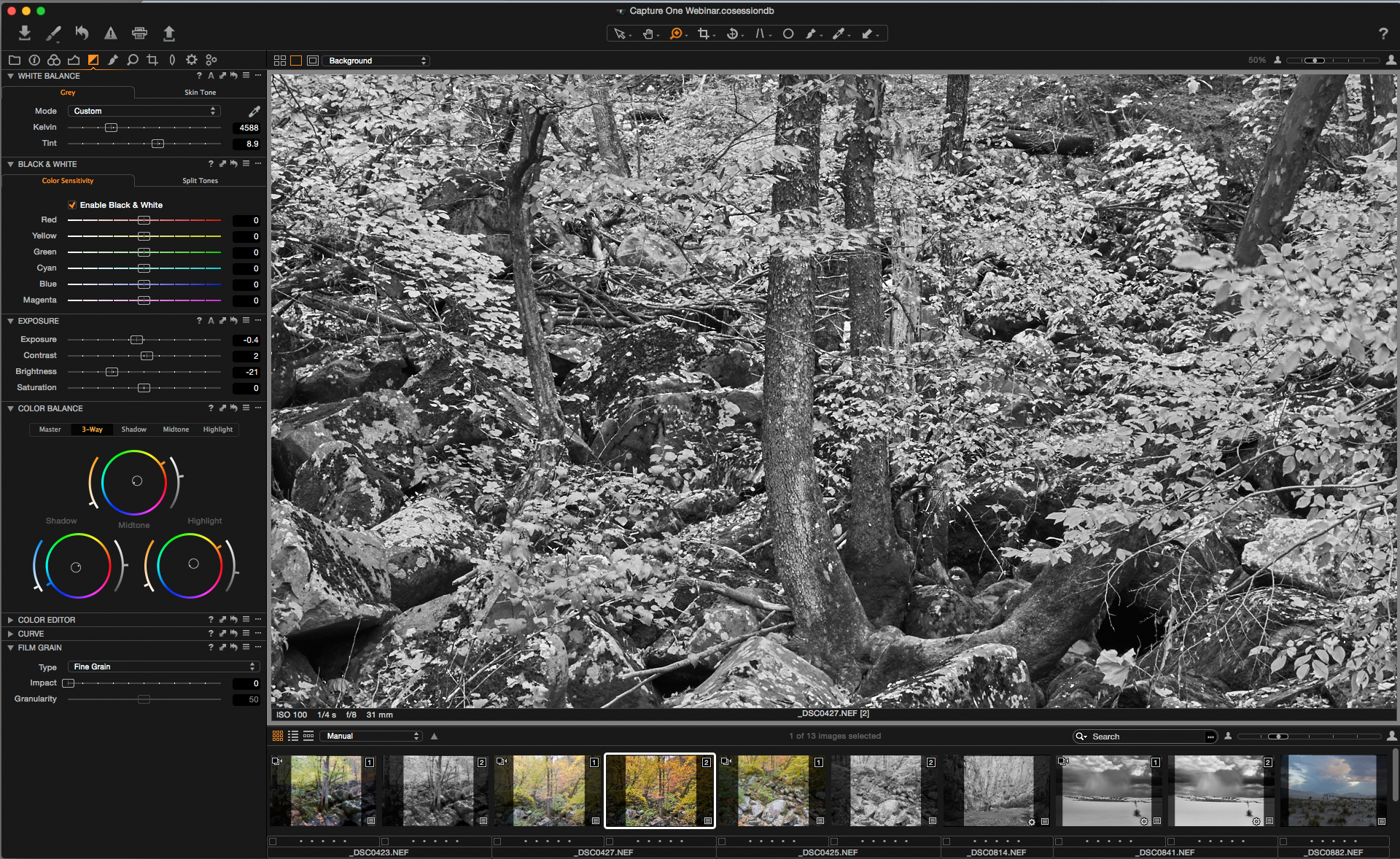
As you would probably imagine, and are most likely already accustomed to doing, take a look at the overall exposure of the image you are going to work on. If there are serious over or underexposure issues, correct that with the exposure settings first. However, before going too extreme with the exposure setting, check to see if there is a processing curve that is better suited to the image. Sometimes the default initial curve isn't appropriate for that particular image. If the shadows look too blocked up, choose the “film extra shadow” option. Conversely, if it feels too flat, choose the “film high contrast” setting. I tend to err on the side of too little contrast or a little flat in the initial processing; low contrast is easily corrected with an adjustment layer and increasing contrast is something that is best done gradually so you don’t overdo it. We want to start with a full range of tones, with midtone separation, but not overly contrasty. Assuming the exposure is ok, one of my first moves is to the High Dynamic Range Setting. Usually anything that says HDR makes me run away like my pants are on fire, but this option in C 1 is actually one of the main reasons I prefer it as a RAW converter. Adjusting this setting has a way of opening up shadows and bringing back detail in highlights that is easier, faster, or and more beautiful than in other RAW converters. The initial Dynamic Range settings are usually between 10-50 and sometimes more for the highlight setting depending on the scene.
Clarity and Structure
The update last year to Capture 1 pro 8 brought us the addition of "natural" to the Clarity and Structure settings, which I think is much nicer than the previous options of Punch/Classic/Neutral. The Natural setting feels better and less processed than the other options.
Clarity
Now I will usually go down to Clarity and Structure and give those a boost. As I mentioned, I don't like to overdo the contrast too quickly, so I keep the clarity setting between 24-36. If certain parts of the image need more clarity, I will do it selectively with adjustment layers
Structure
I tend to keep the structure setting fairly low. I think the halo around sharpened edges is a dead giveaway of bad inkjet prints, and keeping the initial structure setting low can help prevent that problem. We want just enough to make it crisp but so much that it makes it appear brittle.
Basic Black and White Conversion
The prebuilt color filtration settings are decent and are usually good starting points, but I prefer to create my own and use those as a starting point for each image (naturally).
Creating Custom Preset Conversion Filters
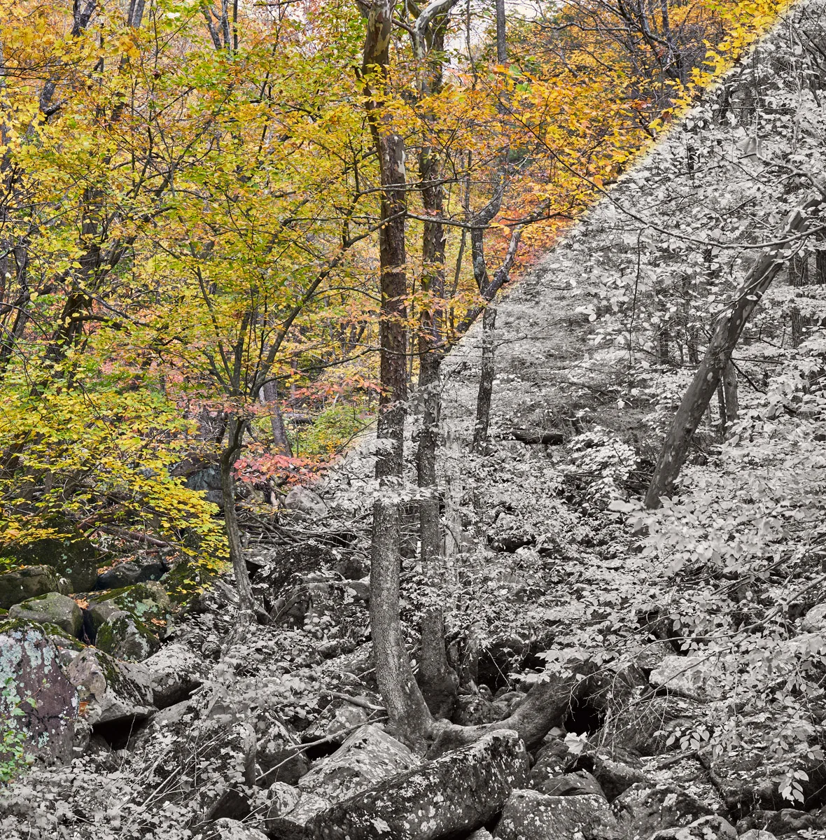
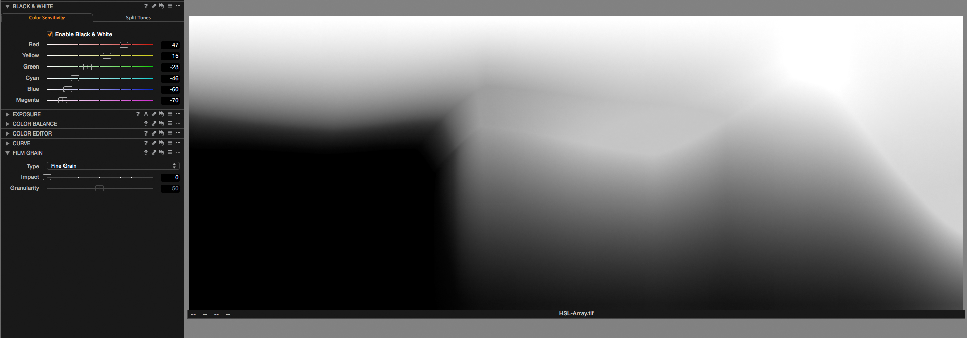
The presets I create for the black and white conversion settings are based on the work I’ve done in Photoshop and Lightroom, but the adjustments don’t need to be as extreme when working in Capture One. Most of my presets have a similar shape with a stepped pattern from one color range to the next. The idea here is that there is never a large jump that could lead to a posterized look. Here is an example of a yellow-green style filter I use for pictures with clouds and skies, but which also works well for fall foliage.

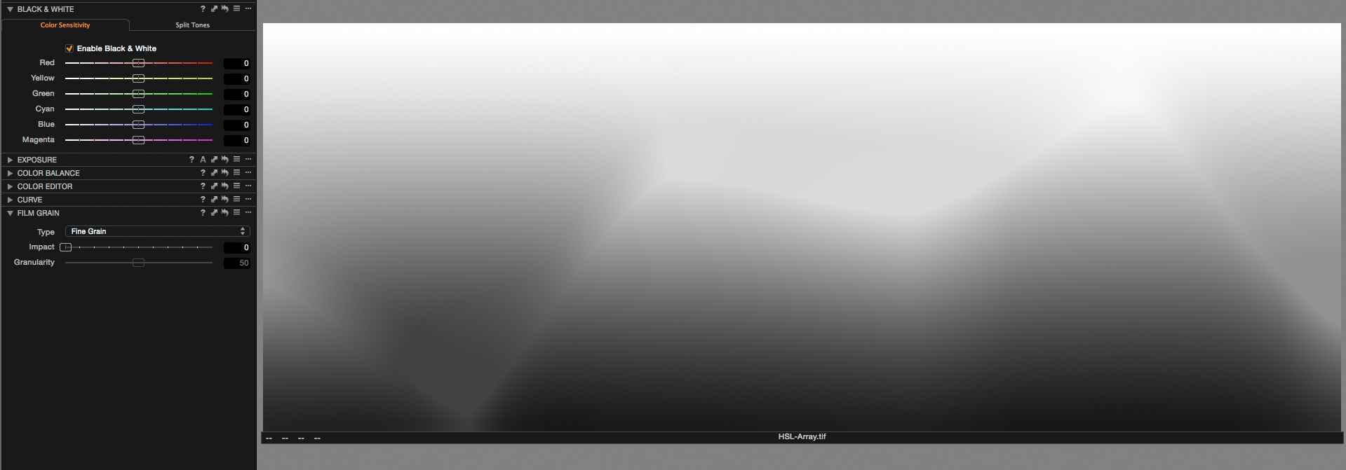
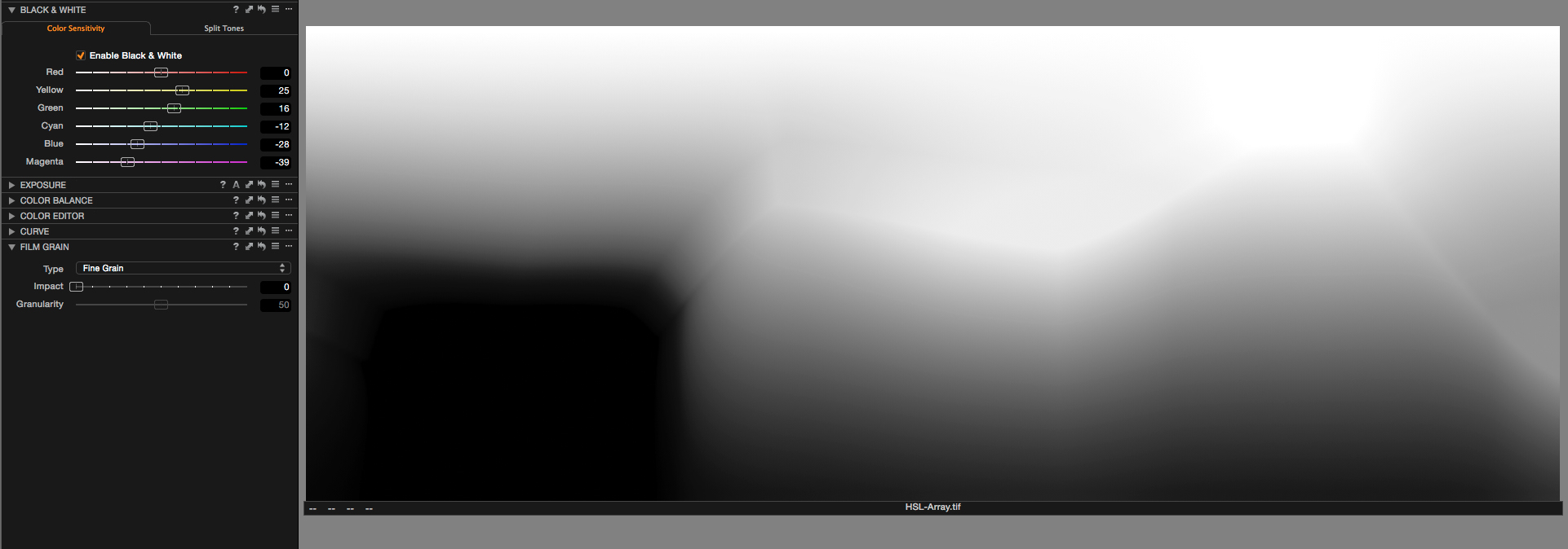
I created this image in Photoshop to approximate the visual spectrum, and use it to create different custom black and white conversion filters. You can download it here from my public BWMastery Toolbox Dropbox folder, then import it into your Capture One catalog and use it to see the affect of different black and white filtration settings.

More Control with Color Balance with Black and White
Changing the color balance does work and allows you to change different parts or the scale differently. When combined with color “filters” for black and white conversion, it can add an additional layer of control and impact to the image.
Even More Control with the Color Editor
The Color Editor tool provides an even deeper level of control in that you can select the range of color and shift it around. When the black and white check is enabled, it will allow you to see how decreasing the saturation or luminosity of specific colors can help smooth any harsh transitions or temper/increase the filtration of that range of colors.
Sign up for a One-on-One Skype session to see this workflow in action
I offer one-on-one Skype training sessions on a limited basis to personally show you my workflow using your images. During the session you are able to see my display as I work through your image in real time as I explain each step in complete detail. You are able to interject questions at any time or ask to see the steps as many times as needed. I also provide a video recording of the session for you to refer back to at your leisure.
Each session is long enough to work quickly with a technique on a few different images, or work to completion with a single image. I also offer a 3-session block that is designed around my Intuitive Localized Contrast Control method, and preparing for print with my personal sharpening and printing workflow, although since each session is personalized to your needs it can be on any topic you choose.

Individualized private instruction from the comfort of your home
Topics can include:
Beginner through advanced digital black and white editing and printing using Capture One Pro and Photoshop
Digital negative creation and calibration
Inkjet printer calibration and profiling
Individualized Critique Session
Beginning through Advanced Digital Black and White Editing and Printing Techniques
Individualized private Photoshop instruction from the comfort of your own home.