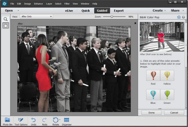
Photographers coming from the darkroom are accustomed to the terms Burning and Dodging, to "make darker" and "make lighter". This is one of the foundations of gelatin silver printing, and one of the first things taught when the safelight comes on.
If you are coming to digital editing from the traditional darkroom, the concept of burning and dodging is obvious to you, but more and more people are coming directly to digital photography and never having a connection to making prints with light, paper, and chemicals. So for you digital people: Burning and Dodging is one of the carryover terms from the analog darkroom, where to make an area darker, you would "burn it in" by allowing more light to pass through the negative. I can't tell you how many different size pieces of cardboard with various sizes and shapes cut in them I have strewn about the darkroom. Dodging is simply blocking some of the light from passing through the negative during the initial exposure, either with cardboard shapes taped to pieces of bent coat hangers or shapes made with your hands and fingers—print-making with shadow puppets.
Back in my post, It Only Looks Steep When You're Standing at the Bottom, I talked about images being made of individual tones, and the difference between those tones is "contrast", which makes up the perception of detail. This is the same concept when printing in the darkroom, changing local contrast by burning and dodging, and by split-filter printing (burning/dodging with different contrast filters with MultiGrade papers). A similar effect can be achieved with graded papers since the increase or decrease in exposure affects tonalities differently depending on the density of the negative. While these techniques are mostly associated with changing the overall lightness and darkness, they are also very useful ways of changing local contrast.
Between 2002-2008, when I worked in the darkroom shaking trays and finishing prints—sometimes for 50-60 hours a week—it was drilled into me that tone and local contrast is as much of a structural element as the trees, rocks, or buildings in a picture, and that you can change the structure of a picture by burning or dodging a bit of road here, or some leaves there. I learned techniques to make some leaves or reflected water separate just a little more, changing the local contrast ever so slightly with a little wave of a hand under the light. These are often only slight changes from print to print, made on the fly after years of experience of knowing how different materials react, but you develop an eye for subtlety, and subtlety is what separates a good print from a great print.

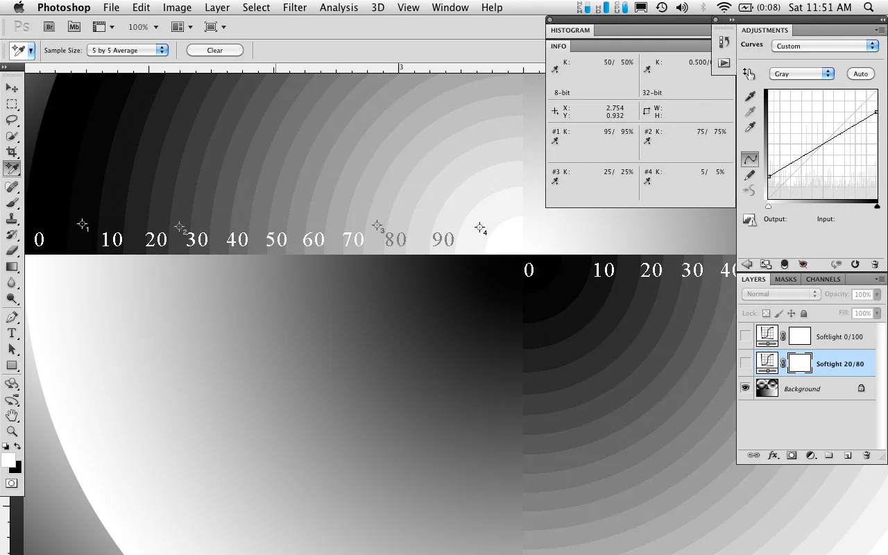
Example Burn and Dodge Curves Layer Masks
So how can this be translated to working digitally?
Just like first learning to burn and dodge in the darkroom, one of the first techniques I teach when using Photoshop is to work intuitively with curves adjustment layers and their associated layer masks. Instead of developing years of trial and error experience to know how printing materials react to different filters and increases or decreases in exposure, and creating multiple test prints, we can now respond immediately to the image on the display and how the feeling and structure of it changes when altering differences between tones.
Digital editing has taken those same basic ideas from the darkroom and given us a far greater degree of control, and the ability to fine tune the tonal values of the image in ways never possible in the darkroom. While this can lead to some garish and terrible aesthetic decisions, it can also enable enhancements that can bring life to an otherwise lackluster composition, or make an already good picture a great one.
As I mentioned earlier, contrast is simply the degree of difference between one tonal value and the next. When burning and dodging we are simply either increasing or decreasing the contrast of one local area compared to other local areas. While we might be making things lighter or darker, not all tones along the scale are changing at the same rate. Sometimes more of the change happens in the midtones relative to the shadows, etc. With the curves adjustment layer we can specify what range of tones is changing, and to what specific value. Then when used with a layer-mask we can control how much of that overall edit is able to affect local areas.
Don't Burn and Dodge with the Burn and Dodge Tools
Why not just use the dodge and burn tools in the toolbar? Those burn and dodge tools (keyboard shortcut - 'O' ) use preset formulas to control the effect of the adjustment, and only work on an image/pixel layer. To work non-destructively you will need to have a copy of the image layer for each of the burn/dodge layers you create. You might have different layers that either deal with separate parts of the tonal scale, or are separated into a "burn" layer and a "dodge" layer. If you have several of these 16-bit image layers, the file size can start to balloon pretty quickly. While there are a few additional controls that allow the burn/dodge adjustment to affect the shadows/midtones/highlights separately, there is no way to control the maximum adjustment, so it is possible to go way overboard without the ability to easily dial it back later in the editing process. This lack of ability to easily dial back or undo the burn/dodge effect is the biggest drawback of using these tools—it is possible, but not easy nor intuitive. It involves making a history snapshot before making the edits and then painting with the history/eraser brush, but it doesn't allow you to re-edit or change the contrast without doing even more burning and dodging.
Instead of simply referring to the curves adjustment layer and masking technique as "Burning and Dodging", which can be confused with the the Burn and Dodge tool in the Photoshop toolbar, I call this method Intuitive Localized Contrast Control, or ILCC for short. In the next post I will introduce the use of the curves adjustment layer and how it can be more useful than many of the other lightness and contrast adjustment layers.